Almost a year ago, I was asked by Michelle Wilkie to join her
Colour Blog series as a
guest and share my process for choosing colour palettes.
After
an overwhelming response to what people want to know about designing modern
quilts, Michelle has decided to run a blog series on colour. It runs throughout
2016 with a different colour focused each month. Her goal was to teach colour
theory in a more practical approach for quilters with the posts that include:
•
fabric pulls,
•
general tips to try (Inspiration Color board, Using focus prints to
pull a color palette, using nature to draw inspiration, looking at other art
mediums/other works, using paint chips...etc.)
•
links to various general resources (Books, magazines, color palette
websites, classes available, Pinterest, galleries/artists...etc.)
•
Tasks + link-ups for those that are interested.
My
task was to talk about my favourite color and to answer some questions like: “How
I choose color?” and “Where do I get color palette inspiration?”
So,
let’s get started;)
My favourite
colous are teal (aqua) and purple. Teal or aqua, as shades of blue are the
most beautiful and inspiring colour tones.
I
was very flattered to be Pat Sloan’s guest at Aurifilbuzz last month, as the
Designer of the Month of September and I also had the task to choose my
favourite shades of blue and put a collage with those hues.
If
I could, I would place aqua tones in each fabric collection, because I never
get bored of it as colour. It’s the most beautiful colour of the sea and a
colour that looks so live, intense and refreshing.
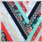
You
can see the block I made inspired with aqua tones (created with my fabrics) and
also download a free block.
For
this occasion, I made this collage with my own aqua/teal fabrics, released with
Art Gallery fabrics, in the past 3 years.
And
while creating it, I realized that actually each of my fabric collections had some shade of aqua/teal/turquoise included. Only
in my latest “InBlue” fabric collection(it will be introduced at the Quilt
Market later this month), I didn’t include it, because I wanted
to move a bit from my “comfort zone” and make a fabric collection featuring
more cobalt tones and primary shade of blue, that is more tricky to blend with
other tones.
So
going back to the questions: “How do I choose color?”
and “Where do I get color palette inspiration?”, my answer would be that all
starts with the theme or inspiration.
So,
once I decide and know what my design theme is going to be, I think about the
best colours to depict it. I create the color palette, choosing from the
Pantone (Fashion+Home) colour cards and finding the best shades within the
existing Pure elements by Art Gallery fabrics. So, it’s basically the theme or
the use of the fabrics that determine the tones that I will use. If I design something that will be more
suitable for the little ones, my colour palette will tend to soften a bit from
my usual bold tendency.
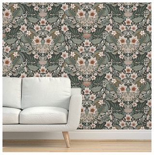
When
designing quilt patterns, as I usually have the certain Fabric collection which
should be featured and shown in the best way through a quilt pattern, I like to
play with different type of contrasts. I also like combining strong, saturated
colours with some subtle and non-coloured tones, like white, grey and black. I
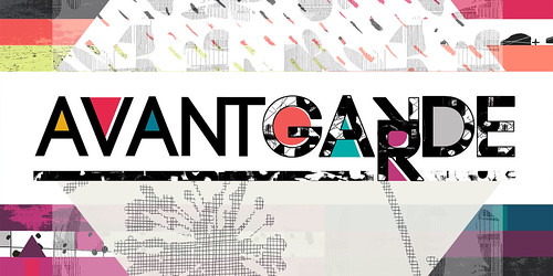
like the combination of low valued prints with very bold ones, like I tried to
do with my Avantgarde fabric collection and prints.
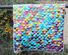
Mock-up
for the Flux quilt featuring Avantgarde fabrics
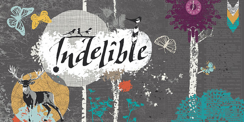
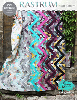
Rastrum
quilt featuring Indelible fabrics
Mock-up
for the quilt featuring Pandalicious fabrics
Maybe
here I can step aside and try to include some basic colour theories that may be
very interesting for modern quilters, if they didn’t have a way to hear about
them in some art classes.
Paul
Klee / Small Regatta, 1922.
Paul
Klee / Tomb in Three parts 1923.
And
if more interested about the colour theory, you can try to find the book “The
elements of Color” by Johannes Itten, which served as some kind of Bible to me,
when first studying about colour theory.
Itten,
was an artist and a teacher in Bauhaus school and from his work and work by
other Bauhaus teachers and students, you can get a lot of inspiration for the
quilts as well ( for example: Josef Albers, Anni Albers, Paul Klee, Wassily
Kandinsky, Gunta Stölzl etc.)

Johannes Itten made a color sphere
comprised of twelve colours (three primary, three secondary, and six tertiary)
that shows the relationship among colors, as well as gradations of
saturation. Itten’s concept was based on seven different methods of
contrast: contrast of saturation, of light and dark, of extension,
complementary contrast, simultaneous contrast, contrast of hue, and contrast
between warm and cool colors. He was absorbed by the work of the old
masters and he was also a vital participant in modern art movements. Itten has
been the first to associate color
palettes with four types of people. He began by splitting
colours into 2 sections: WARM (yellow based) and COOL (blue based). These were
then divided again into LIGHT or DARK. The result was 4 harmonized groups of
colours that he called after the 4 seasons of the year. (spring = warm + light,
autumn = warm + dark, summer = cool + light, winter = cool = dark).
I
hope that some of this was inspiring read for modern quilters and can’t wait to
read all the posts from this series and here is the list of all the
participants:
Month
|
Colour
|
Guest/s
|
January
|
|
Michelle Wilkie http://factotum-of-arts.com
|
February
|
|
Melanie Tuazon http://melintheattic.com
|
March
|
|
Daisy Aschehoug http://antstosugar.com
|
April
|
|
Anne Sullivan http://play-crafts.com
|
May
|
|
Heather Jones http://www.heatherjonesstudio.com/blog
|
June
|
Purple
|
Sandi Sawa
Hazlewood http://craftyplanner.com
|
July
|
|
|
August
|
|
Alyce Blyth http://blossomheartquilts.com
|
September
|
|
Christa Watson http://christaquilts.com
|
October
|
Aqua/Teal
|
Katarina Roccella http://likeflowersandbutterflies.com
|
November
|
Grey
|
Nicole Daksiewicz http://modernhandcraft.com
Nydia Kehnle http://www.nydiakehnle.com/
|
December
|
Red
|
|
Michelle, thank you so much
for having me,
Xx,
Katarina
Links:


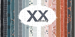


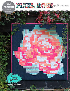
 GRID
GRID
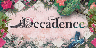 DECADENCE


