

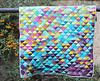
Hi there and huge WELCOME to my Cabin Spark QUILT sew-ALONG!
Cabin Spark quilt-along schedule:
- Week 1, October 24 - Kickoff + Fabric Pull
- Week 2, October 31 - Cutting Party
- Week 3, November 7 - Block Construction
- Week 4, November 14 - Layout + Assembly
- Week 5, November 21 - Quilting + Finish


I always suggest to read the pattern before starting to pick and cut the necessary fabrics.
While I have only PDF patterns available, there are some quilt shops that like to buy the printing license from me (available in my Etsy shop as well) and they print the patterns on paper to provide them for their customers that prefer to buy the paper pattern and the fabrics together.

Before finally posting the video for you to watch, I just want to THANK you so much for joining me in this quilt sew-along event and I hope that you will enjoy sewing with me and other makers!
Although most of you will watch the video only, I thought I should also include some captions from the video, maybe they can be helpful too, as I am sure that there are parts in the video where my English could sound confusing.

While choosing fabrics for a quilt can be the most exciting part of the process for some makers, for others it can feel a little intimidating—or even overwhelming. That’s why fabric kits and curated bundles are often such a helpful option. Another way to “test drive” your fabric ideas is by using the coloring page included in most patterns.

Before we dive deep into color theory, let’s touch on a few simple, practical principles for fabric selection.
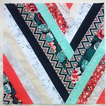
The safest place to start is by looking at contrast. In quilts with lots of negative space, contrast helps define the line between the background and the foreground (the block or main design). Put simply, contrast means “difference,” and it ensures that your blocks stand out against the background. The most common types are light vs. dark and warm vs. cool contrasts.

In this particular pattern, though, the task is slightly different. Here, the blocks are unified, and the secondary design appears as classic sawtooth star shapes. To highlight those stars, I used a solid white fabric, which creates a crisp contrast with the surrounding prints. So my suggestion is: for the star corners, choose fabrics that are either very light, very dark, or clearly contrasting with the rest of your palette. This way, the star design will shine through the patchwork.

As AGF offers Fat Quarter Fabric Wonders bundles—usually consisting of 16 assorted prints from each collection—like in the case of the Adventale collection, you can easily use just one bundle! Simply add one coordinating solid fabric for the star corners and another option for block centers, and you’ll have everything you need to make a beautiful baby-{squared throw} size quilt with 16 blocks.

For my throw-size version, as stated in the requirements table, I used a mix of 20 different fabrics for the logs, 1 fabric for the stars, and 1 fabric-panel for the block centers.

For this quilt, my fabric selection is based on my Adventale collection. If the collection had a wider range of prints, I would likely avoid the lightest fabrics, as they don’t provide enough contrast with the white sawtooth stars. That’s why I plan to use the lighter fabrics mainly for the smaller logs closer to the center of the block, where they won’t “touch” the stars. And I will do something that would be described as "scrappy" style, almost random piecing (…except for making sure the darker fabrics touch the corner stars, while the lighter ones flow toward the center).

When choosing fabrics, the safest and most effective approach—like I mentioned before—is to select logs that will clearly stand out against the fabric used for the star corners. Within the group of logs themselves, the fabrics should feel harmonious, meaning there shouldn’t be too much contrast and difference in value. You can choose any colors you like—even a rainbow palette—as long as they contrast well with the star corners.

One of the most common and effective ways to use contrast within a log cabin block is to select one distinct group or palette of colors or prints for one diagonal half of the block, and then use a contrasting set for the other half. This creates a striking effect, especially when you start playing with quilt layouts. However, if you’re working with directional prints for the centers, you’ll want to plan carefully so the final image comes together the way you intend.

The centers, on the other hand, offer a great opportunity to get creative. You can play with value, color, or even small block design. For example, in this last example, I’ve used small heart-shaped blocks for the centers, which also makes it perfect for a Valentine’s-themed version.
For my version of the quilt, I’ll be using the squares with scenes from my Welcome Home panel. They measure about 6.5”, so I can either trim them down with a 6” square ruler or, if I want them to stand out a bit more, cut them to 5” and add a 1” strip frame—just as shown above. I think I’ll go with that option.


On the other hand, if I were using the alphabet letters from the Jingle All the Letters panel, I’d cut them true to size at 6” right away. Since the background fabric there is dark, the letters already stand out beautifully against any of the log prints I’d be pairing them with.

Please feel free to contact me with any questions, suggestions or comments either here or on Instagram.


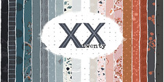


 GRID
GRID
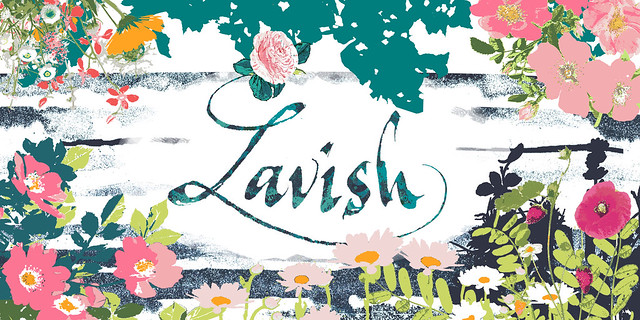
 DECADENCE


3 comments :
Good post! I was checking out a few sites for online discounts the other day and found DealPromoX. It had some decent offers and seemed pretty straightforward to use. Thought it might be worth mentioning since it could help others looking for similar stuff.
HOW I RECOVER MY $73,000 FROM SCAMMER CALLED SUSAN 2026
As a woman diagnosed with cancer, I found myself in a desperate situation, needing money for surgery. In my search for help, I encountered a woman named Susan on Instagram who claimed to be a crypto expert. She promised to turn my $73,000 into $340,000 in no time, and I fell for it. Unfortunately, it was a scam, and I lost everything. Feeling hopeless, a friend recommended JetWebHackers. I contacted them immediately, and to my amazement, they were able to recover a significant portion of my investment—$290,000! I am forever grateful for their expertise and support. If you find yourself in a similar situation, I highly recommend them. They truly are the best recovery team out there! 🙏💖
Reach out to them today and turn your situation around!
EMAIL: jetwebhackers@gmail.com
Telegram: @jetwebhackers
WhatsApp: +1(763)357-2550
I am Ms. Beate Heister, a German entrepreneur, investor, and shareholder in the discount supermarket chain Aldi. I donate 25% of my personal wealth to charitable causes around the world. I have also pledged the remaining 25% to private individuals this year. I have decided to donate €1,500,000.00 to you. This is part of my pledge for this year's charity project. If you are interested in my donation, please contact me for more information.
Best regards
Ms. Beate Heister
Managing Director of the Beate Group.
Please write to my official email address:
heisterbeate06@gmail.com
Post a Comment